As an add on to our blog module our teacher set us the task to design business cards, A5 Postcards and an A3 Poster to promote our work and provide contact details to viewers of our end of year show. I made a little book and drew sketches of the pictures I wanted to take for the business card fronts as I think some of my work to date hasn't shown my style. At first I overthought this project and was thinking of colour schemes because I wanted the font on the back to be colours from the image on the front so they matched and looked more thought out. I then researched Moo as I will use them to get mine printed and realised that you can have up to 50 different images on the front but the back has to be the same so unfortunately I will just have to have black and white as a neutral ground. I have designed some A5 postcards and posters which I think show my style well, they are clear and straight to the point.


These are two of the posters I designed. I think my strong point to date has been portraiture and food photography and so I chose to display them. I think I prefer the top image as it has more contrast between the font and the image which draws more attention to it and the fact that it is advertising the exhibition which is the point.

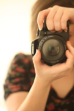
This is one of the images I have used as a frontplate to my business cards. I think it shows my style and came out as I intended when I shot the picture that I am pleased enough with it to put it on my business card.
No comments:
Post a Comment