For our Understanding Client Briefs module we have been thinking about Stock Image Agencies. Our brief was to take 10 different stock images ( we were allowed to use 2 previous images taken for this module ) and to upload them to a few stock image agencies to try and get accepted and to get feedback on our images. We have had to research agencies such as Istock and Getty Images to find out what they are looking for and what they have too much of. Getty Images in particular are good as they post what they are looking for on a twitter page which gets updated frequently. Once I decided what I wanted to shoot after looking around my flat and finding little objects I searched for those items on the sites to see how many images they already had. Some of the images Itook there was quite a lot of similar images on the sites already but to be honest I was quite last minute with this project due to things beyond my control.
Paul Cockney, a portrait photographer turned full time stock image photographer came in to college twice to teach us. The first time he came in he set us the brief and pointed out things that the agencies would look for in our images such as noise, sensor dust, blur and chromatic abberation. He then came back in to look at the images we had taken, to offer feedback and if necessary criticism and to advise us of which ones to attempt to upload to istockphoto.
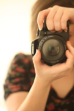
The images I took are below.
I thought I was being smart by taking a picture of this pack of cards we bought whilst in Sweden. I thought due to the Queen having a D instead of a Q and similarly a Jack is shown with a Kn that it would make it unique and there would be more chance of there not being similar pictures. However Paul pointed out that it would also limit its usage and also runs the risk of someone downloading it thinking it was an english pack of cards and then later down the line finding out it wasn't and having to start the process of whatever its been used in again with a new image. This wouldn't cause me any problems but he thought it best not to upload it.

This picture of pizza was very last minute, it was actually my tea for the night before we had to have the pictures taken for. I just took it to make up to 10. The pizza was slighty burnt round the edges which Paul pointed out, if you are going to take an image of food make it look appealing, a burnt pizza would of only looked right if it was overly burnt and had a student looking person holding it which is right.


These cupcake images were the 2 images from previous that I used for this. I felt they were clean and commercial enough to be uploaded. I have attempted to use the second image to get into istockphoto as I was told the first image is a bit plain and not as bright as the second.

This is actually curry powder. It was one of the random objects I grabbed from my flat just because I had bought the wrong curry powder once so it was going spare. I thought to do this so when I got to the studio I dumped the whole pot of curry powder on to a piece of foam board and wrote this in it. I then cleaned up the writing on photoshop. I wish there was more powder on the lower right hand side as its a bit lop-sided but I liked it enough to upload it to istockphoto.


 I took this picture of a stuffed mushroom cap when I was home over Easter. My mum thankfully made them for me to take pictures of. I didn't intend on using it for this task, I only shot it because I wanted to try out some food photography however I realised that it is quite specific so there might not be many images like it. I also realised that I could use it as it wasn't used for any of our previous modules. I have tried to upload this one to istockphoto.
 This is a make up set I had at home which I've never actually used. I thought it would look cool with a shallow depth of field which it does but unfortunately due to not having a tripod at home and not thinking of making one out of boxes etc they numbers on the palette are a bit shaky so their isn't a point of focus so I can't upload it. It was also suggested if I reshoot it to have a make up brush in the background to make it more commercial and obvious what it is.